Trade Mark Evaluation: A Look at Famous Brands Logo Change Over Time
Logo changes are a strategic aspect of brand evolution, reflecting a company's growth, market shifts, and consumer engagement. Famous brands like Apple, Coca-Cola, Nike, Starbucks, Google have evolved their logos over time to stay relevant, modernize their image, and connect with new audiences. These changes are not only about aesthetics but also about positioning the brand for future success. This blog explores how famous logos have transformed and what these changes reveal about the brands' strategies, adaptability, and long-term vision.
Introduction:
Trademarks are a crucial part of a brand's identity, and they evolve just as businesses do. A logo change can reflect a shift in a brand’s strategy, values, or target audience. Some of the world's most iconic brands have undergone significant transformations in their logos, from subtle tweaks to complete overhauls. In this blog, we'll explore how famous brands have evolved their logos over time and what these changes say about their growth, market positioning, and adaptability.
Why Do Brands Change Their Logos?
Logo changes are not just about aesthetics; they are strategic decisions made by brands for a variety of reasons, including:
· Rebranding: A company may update its logo to better align with new business goals, a different target audience, or changes in market trends.
· Modernization: As design trends evolve, older logos may look outdated. Brands often update their logos to keep up with the times.
· Expansion: When companies expand into new markets or product categories, they may alter their logos to represent a broader or more global appeal.
· Simplification: Some companies opt to simplify their logos to create a cleaner, more recognizable design, especially for digital platforms.
Famous Logos Changes Over Time:
Let’s take a look at how some well-known brands have transformed their logos over the years:
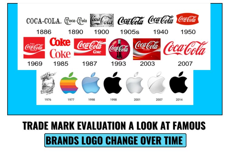
Apple: From Rainbow to Sleek and Minimalist
Apple’s logo has undergone some of the most famous transformations in the tech world. Originally designed in 1976, the first Apple logo featured an intricate, detailed image of Sir Isaac Newton sitting under an apple tree. However, it quickly evolved into a much simpler, more modern design—a rainbow-colored apple with a bite taken out.
In 1998, the iconic rainbow stripes were removed in favor of a sleek, monochromatic look. The now-famous silver apple logo symbolized Apple's shift toward minimalist design principles and a focus on high-end technology products. This change marked Apple's brand evolution from a quirky startup to a sophisticated, globally recognized tech giant.
Coca-Cola: Timeless Yet Evolving
Coca-Cola is one of the oldest and most iconic logos, and it has remained remarkably consistent throughout the years. The logo, introduced in 1887, is based on Spencerian script and has changed little, with only minor tweaks to improve legibility and modernize the design.
While Coca-Cola has maintained its classic red and white color scheme, it has updated the overall design on several occasions to reflect changing trends. Over the years, the company has occasionally introduced new iterations for limited-time campaigns, special events, or product variations (e.g., Coca-Cola Zero, Diet Coke). Despite these updates, the core logo has stayed true to its origins, reinforcing its timeless appeal.
Nike: From a Swoosh to Global Recognition
Nike's logo, known as the "Swoosh," has become one of the most recognizable brand marks in the world. The logo was created in 1971 by graphic designer Carolyn Davidson, and the iconic "Swoosh" represented motion and speed, perfectly capturing the brand's ethos.
Over the years, Nike’s logo has remained remarkably consistent. While the company has experimented with font types and taglines ("Just Do It"), the central Swoosh symbol has remained unchanged. This consistency has helped solidify Nike's position as a global leader in sports apparel and footwear, reinforcing its brand identity as a symbol of athleticism and performance.
Starbucks: Evolving from Retro to Modern
Starbucks is another example of a brand that has undergone multiple logo changes over the years. The original Starbucks logo, created in 1971, depicted a two-tailed siren in a vintage, intricate design. Over time, the logo evolved into a more simplified version of the siren, and the company eventually removed the text surrounding the logo to create a more recognizable and clean look.
In 2011, Starbucks introduced a version of the logo that featured only the green siren without the company name, signaling the brand's growing global recognition. The logo change reflected the company’s transition from a regional coffee shop to an international coffeehouse empire.
Google: From Simple to Playful and Back to Simple
Google's logo has undergone several changes since the company’s founding in 1998. The original logo, created by Sergey Brin, was very basic, featuring only the word "Google" in a simple font with a multicolored design.
Over the years, the font became cleaner, the colors more vibrant, and the design more modern. In 2015, Google rebranded its logo once again, simplifying it with a sleeker, sans-serif typeface. This redesign reflected Google’s shift toward a more versatile brand that could easily adapt to various digital platforms and devices. The playful, colorful look remains, but the simplicity reflects the brand’s innovation and evolution.
To know more about this you can follow the link below:
What These Logo Changes Tell Us About The Brands?
· Adaptability: Brands that update their logos reflect a willingness to evolve and adapt to changing market trends. These changes help companies stay relevant to their target audience while showcasing their growth.
· Modernization: Simplification and modernization are key in today’s digital age. Logos need to be easily recognizable on various platforms, from billboards to smartphones.
· Globalization: As companies expand globally, they often update their logos to be more universally appealing. Simplified designs are easier to recognize and translate across different cultures.
· Timelessness vs. Trendiness: Some brands, like Coca-Cola and Nike, have embraced a more timeless approach to their logos, while others, like Pepsi, have experimented with more modern designs to reflect changing trends.
Conclusion:
Logo evolution is a natural part of a brand’s journey, and it plays a significant role in communicating the brand’s identity, values, and vision to its audience. Famous brands like Apple, Coca-Cola, Nike, Starbucks, and Google have demonstrated that logo changes are more than just cosmetic—they reflect deeper shifts in strategy, market positioning, and consumer expectations. As your business grows, evolving your logo can be an effective way to stay relevant and continue to connect with your audience in new and meaningful ways.
Whether it’s a complete redesign or a subtle refresh, logo evolution tells the story of a brand’s growth, adaptability, and ability to resonate with consumers.